Grocery-Level Freshness,
Pixel-Level Precision
The Goal
The Goal
Create a cohesive, scalable design language that improves consistency and speeds up delivery across teams.
Create a cohesive, scalable design language that improves consistency and speeds up delivery across teams.
Why Design Audit?
Why Design Audit?
We conducted a design audit at Dunzo with a deep sense of care for both our users and internal teams. Over time, as features are built in silos, design inconsistencies naturally creep in—especially without a shared, evolving resource. In the hustle to ship quickly, it's easy to miss updating design files or aligning with newer components. This audit was a way to gently pause, reflect, and uncover emerging patterns that could cause confusion for users, and to restore coherence and clarity in the product experience.
We conducted a design audit at Dunzo with a deep sense of care for both our users and internal teams. Over time, as features are built in silos, design inconsistencies naturally creep in—especially without a shared, evolving resource. In the hustle to ship quickly, it's easy to miss updating design files or aligning with newer components. This audit was a way to gently pause, reflect, and uncover emerging patterns that could cause confusion for users, and to restore coherence and clarity in the product experience.
The Audit Process
The Audit Process
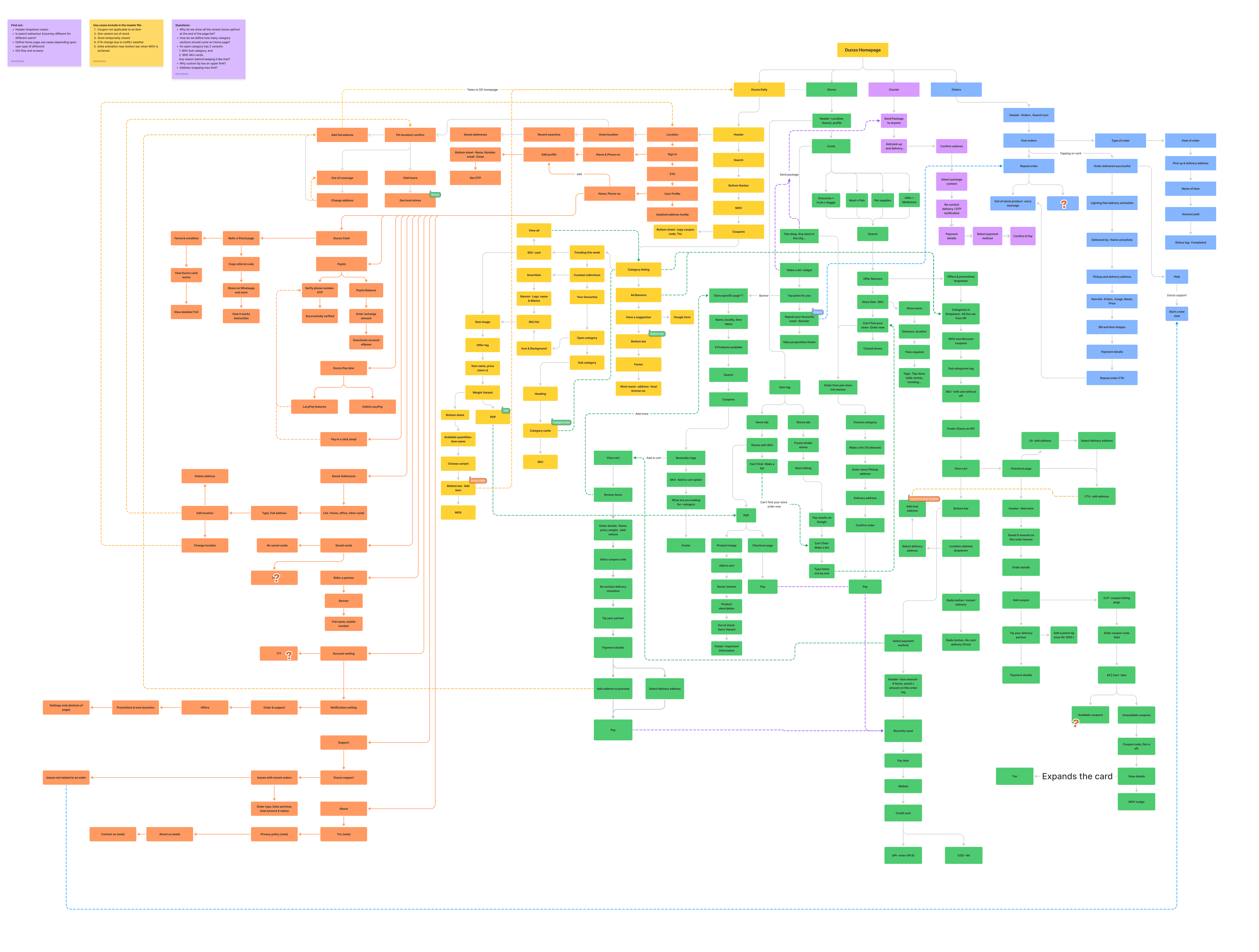
Every screen across major user journeys—onboarding, search, product listing, checkout, and post-order—was reviewed. This helped identify recurring patterns, component usage, and UX flow variations.
Every screen across major user journeys—onboarding, search, product listing, checkout, and post-order—was reviewed. This helped identify recurring patterns, component usage, and UX flow variations.
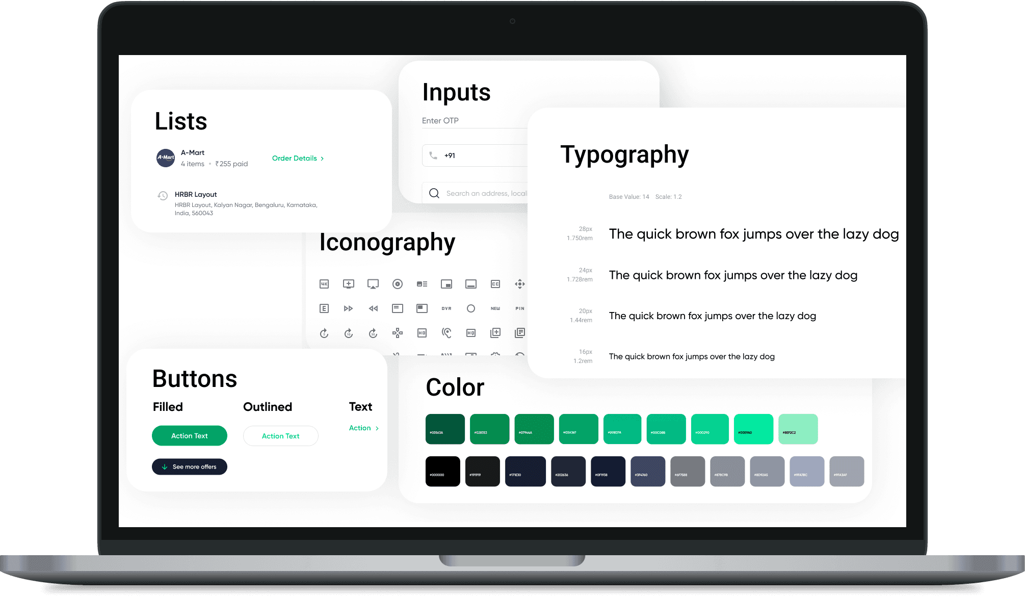
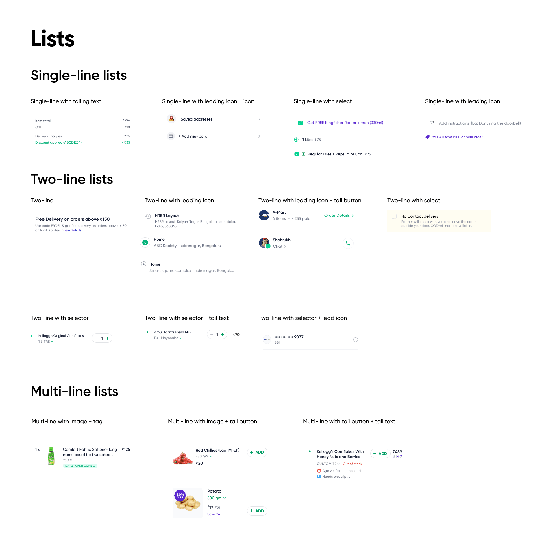
The UI was deconstructed into atomic elements: buttons, input fields, cards, typography styles, modals, headers, colour etc.
The UI was deconstructed into atomic elements: buttons, input fields, cards, typography styles, modals, headers, colour etc.

Key Findings
Key Findings
We found 15 unique text styles with slight variations in sizes.
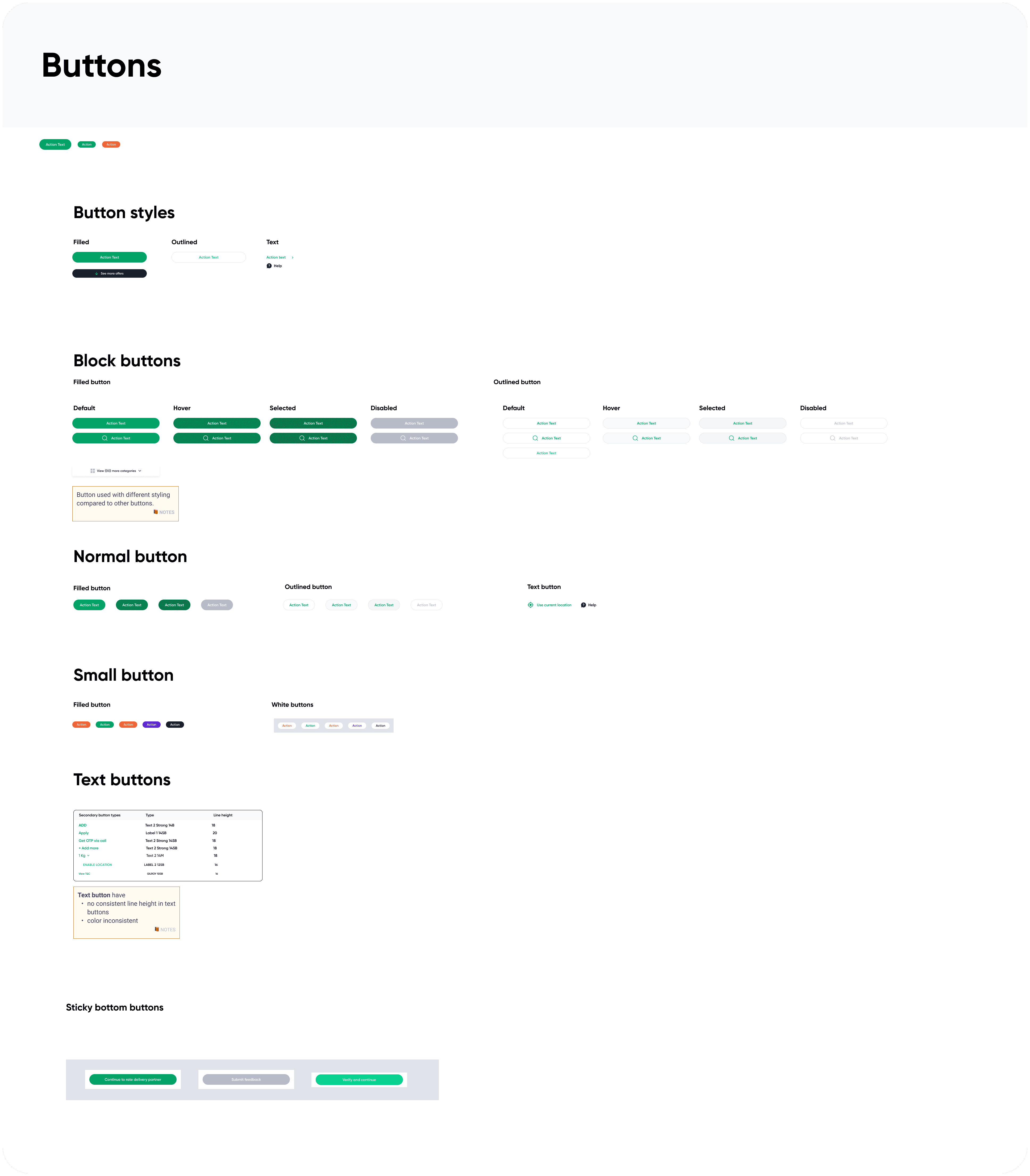
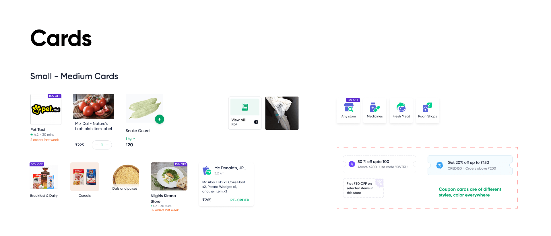
There were noticeable variations in card styles across screens—including differences in layout, sizing, component placement, and a few instances where elevation or corner radius weren’t clearly defined.
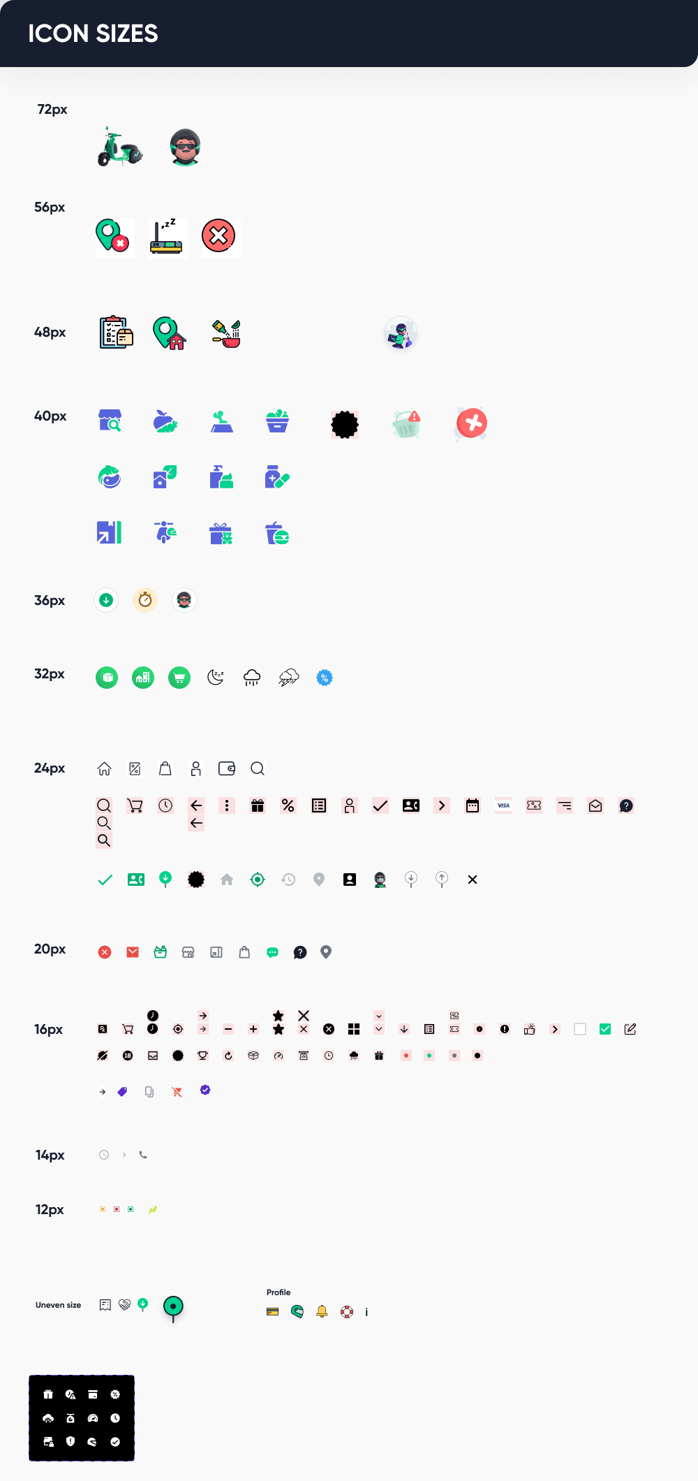
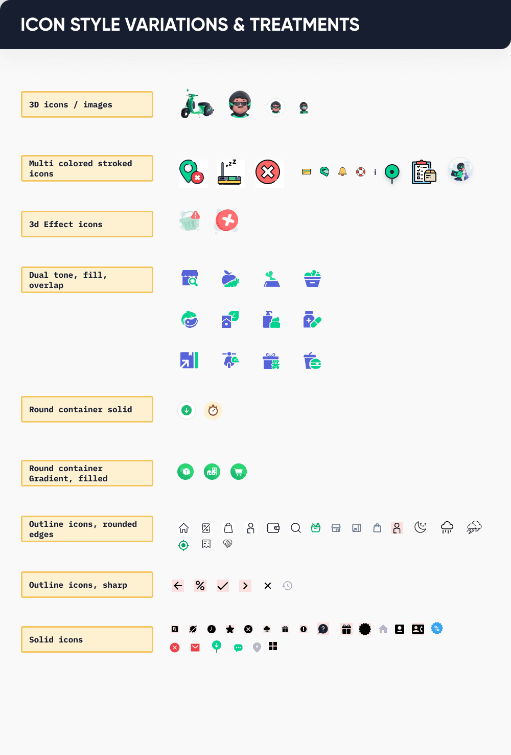
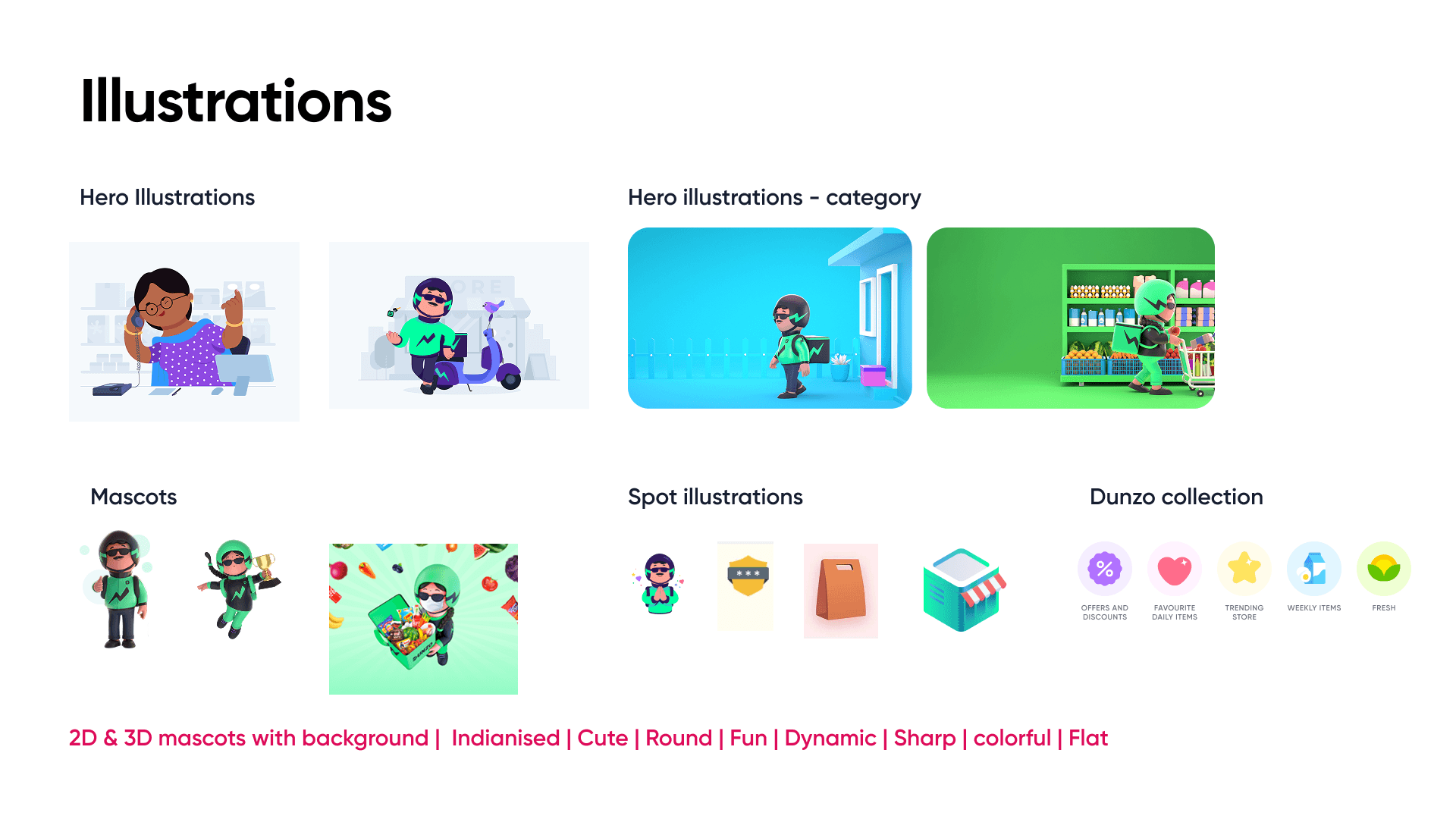
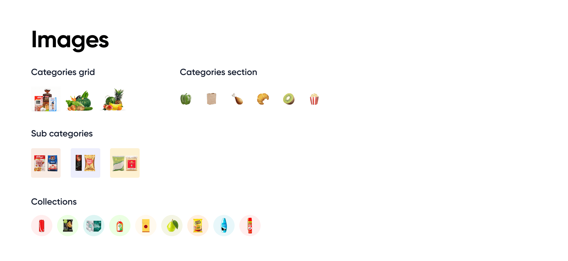
The app features a range of iconography and illustration styles—while some variation is valuable, defining usage guidelines and a consistent color palette could help create a more cohesive and visually balanced experience.
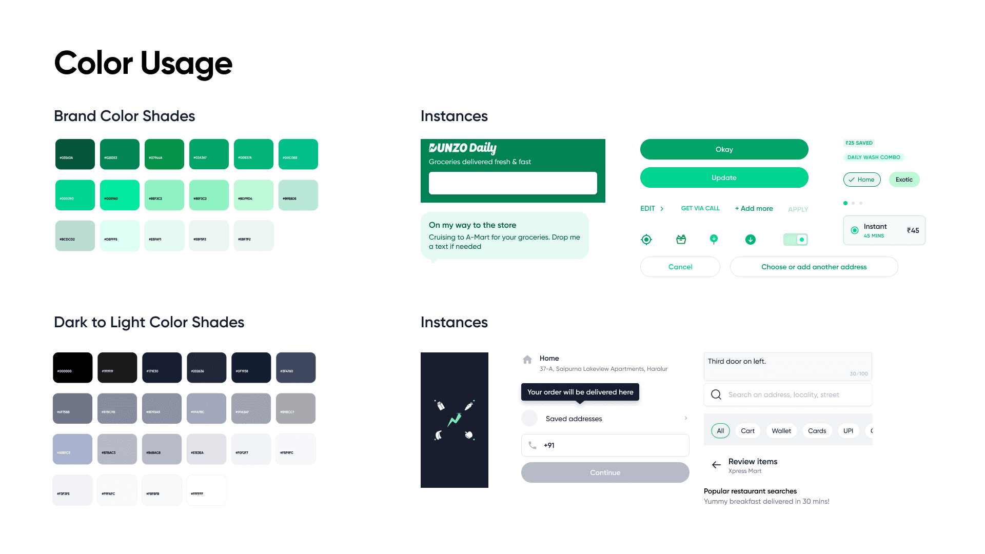
There are several variations in the use of primary, brand, and dark color shades. Establishing clearer guidelines for gradients, scrims, shadows, and overall color usage would help ensure greater visual consistency.
We found 15 unique text styles with slight variations in sizes.
There were noticeable variations in card styles across screens—including differences in layout, sizing, component placement, and a few instances where elevation or corner radius weren’t clearly defined.
The app features a range of iconography and illustration styles—while some variation is valuable, defining usage guidelines and a consistent color palette could help create a more cohesive and visually balanced experience.
There are several variations in the use of primary, brand, and dark color shades. Establishing clearer guidelines for gradients, scrims, shadows, and overall color usage would help ensure greater visual consistency.
Learnings
Design audits are a crucial first step in evaluating a mature product—they help identify inconsistencies and streamline the UI. A well-audited, organized design ensures smoother collaboration and reduces back-and-forth with engineering teams during handoffs.
Learnings
Learnings
Design audits are a crucial first step in evaluating a mature product—they help identify inconsistencies and streamline the UI. A well-audited, organized design ensures smoother collaboration and reduces back-and-forth with engineering teams during handoffs.
Design audits are a crucial first step in evaluating a mature product—they help identify inconsistencies and streamline the UI. A well-audited, organized design ensures smoother collaboration and reduces back-and-forth with engineering teams during handoffs.